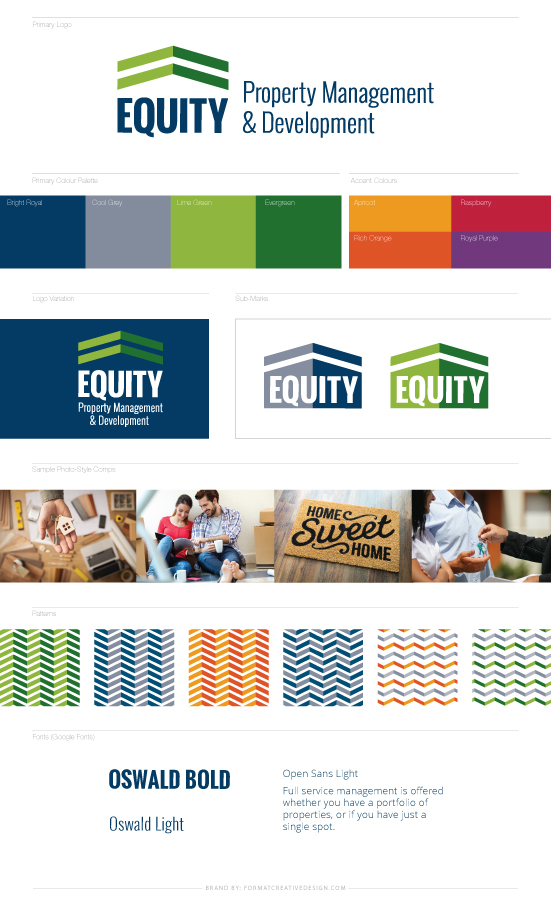
Equity Property Management wanted a brand that was clean, professional, high-end, fresh, and modern. They wanted to appeal to clients looking for property management, as well as be attractive to the tenants that they are currently renting to.
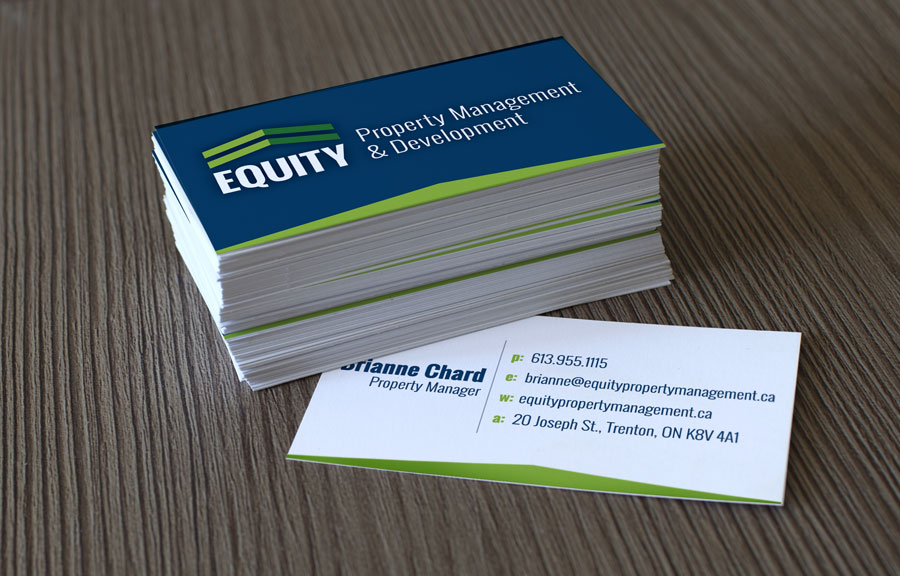
I created a modern brand, using fresh bright colours, bold geometric shapes, and strong modern fonts. Aside from the more traditional main colour palette I added, at our clients request, a series of bold complimentary colours that could be used to indicate different areas of the business at a glance. Making this new brand both modern and functional.
Joelle was very easy to work with and really impressed me with her ideas and professionalism! She has a quick and easy process in place and it makes everything so simple. Would recommend her 100%
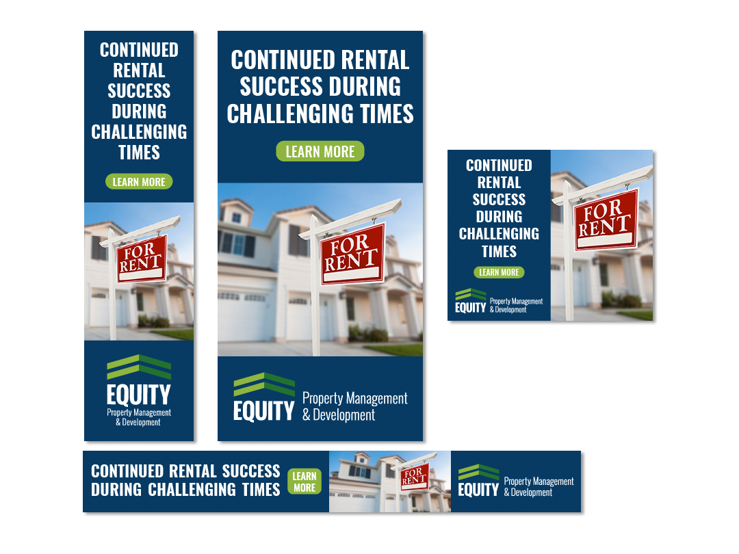
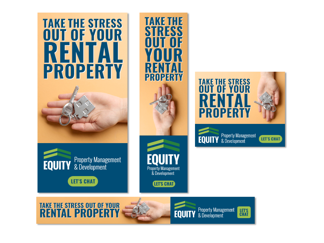
Online Ad Set